


The British Independent Film Festival
A bright new proposed re-brand for the British Independent
Film Festival. With lack of funding available, we wanted to create
a new Identity that had a stand out personality. This was achieved
through the use of a bold colour scheme and image treatment
alongside a very British 'tongue-in-cheek' copy-led campaign.
Film Festival. With lack of funding available, we wanted to create
a new Identity that had a stand out personality. This was achieved
through the use of a bold colour scheme and image treatment
alongside a very British 'tongue-in-cheek' copy-led campaign.
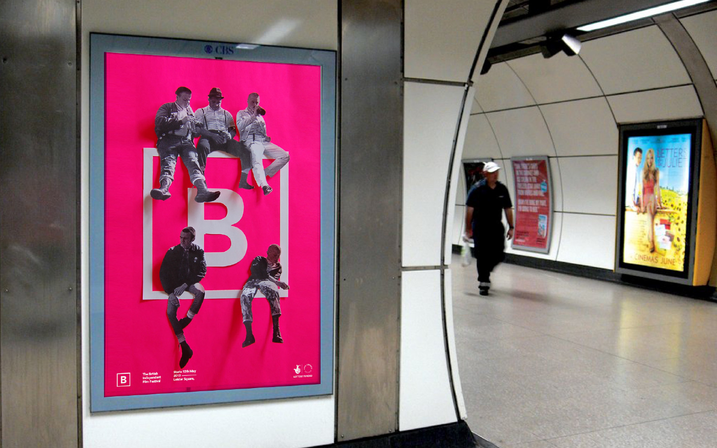

Creating a Buzz
Promotion was important when trying to create a buzz around
the festival. We achieved this by using typically British slang
words and a conversational tone carried through the copy; from
the signage to the print based products. As well as this, imagery
was used from Iconic British Independent Film, mixed with the
branding itself to help the audience make the connection of
the brand to British film.


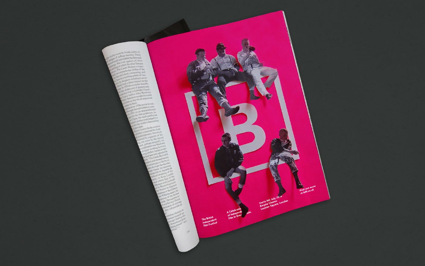
Building the Brand
We built on the festivals' identity primarily through print based
products as these are things that the British public are most likely
to come into contact with. Products created ranged from ticket
stubs and film listings to wristbands, invites and key-rings. Each
piece of communication created uses the stand-out pink colour
scheme, combined with the simple, confident logo and
conversational copy.


Building the Brand
We built on the festivals' identity primarily through print
based products as these are things that the British public
are most likely to come into contact with. Products created
ranged from ticket stubs and film listings to wristbands, invites
and key-rings. Each piece of communication created uses
the stand-out pink colour scheme, combined with the simple,
confident logo and conversational copy.


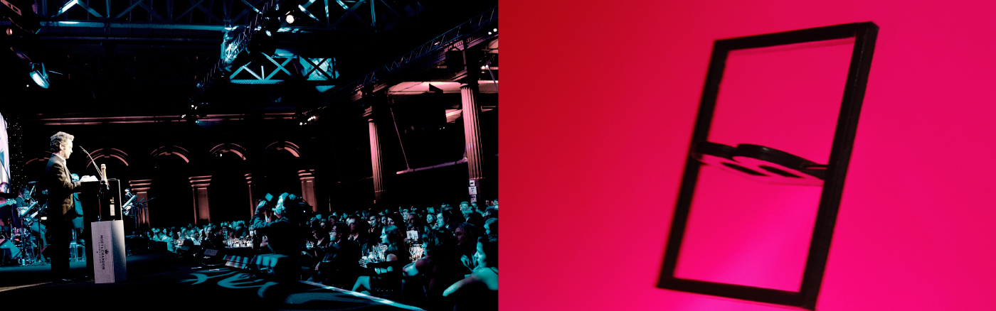
The Awards
The festival comes to a close with its world famous awards
ceremony, where various honors are up for grabs including
Best Film, Best Screenplay and Best Cinematography. The
brand was thoughtfully applied across this event, to make it
all fit together seamlessly. A proposed award was created,
which is an interactive version of the logo. The 'B' hanging
in the centre of the frame is movable, pivoting around the
metal spine.


The Awards
The festival comes to a close with its world famous awards
ceremony, where various honors are up for grabs including
Best Film, Best Screenplay and Best Cinematography.
The brand was thoughtfully applied across this event, to
make it all fit together seamlessly. A proposed award was
created, which is an interactive version of the logo. The 'B'
hanging in the centre of the frame is movable, pivoting
around the metal spine.


Thanks for scrolling
To see the full case study, visit our website;
madebyalphabet.com
Want to work with us?
madebyalphabet.com
Want to work with us?
hello@madebyalphabet.com
Copyright Alphabet 2016. All Rights Reserved
Copyright Alphabet 2016. All Rights Reserved


